Just wanted to post this here too.
Disclaimer: I don't intend to offend anyone, rather just share my own thoughts on Melda UI design practises. I would very much love to work on a new iteration of design for Melda. This comes from a place of appreciation towards the quality of the DSP.
Melda plugins always looked a bit user-unfriendly to me. Very advanced, but not particularly inviting.
When I heard that they added "simpler" UIs modelled after the gear the specific settings were modelling, I was eager to go find some screenshots. Then I saw them...
The generic font, oversaturated colors (this is supposed to be an API) which have no relation to the colors used on the original hardware design...
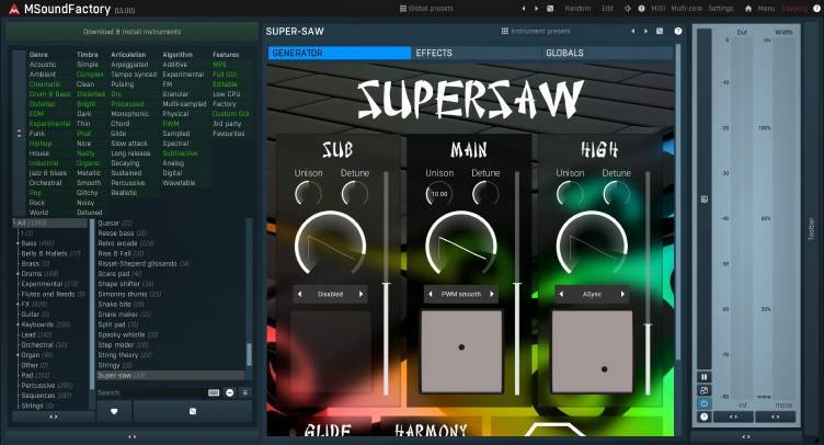
What about the MSoundFactory?
Why did they choose the "chop-suey" wonton font? Why? I simply can't understand the decisions behind this design.
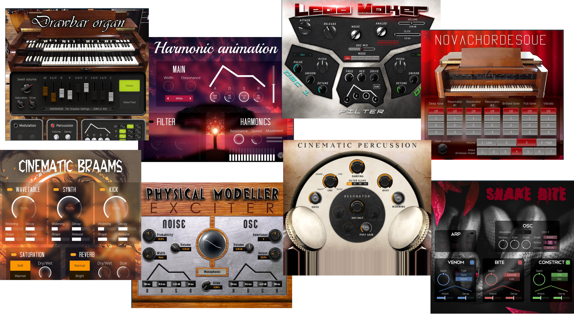
Look at that Lead Maker UI. Knobs which feel randomly put together without any unity between them, the "quirky" shapes - it just looks like a "cool" UI from 2005. Toxic cyan, green and red don't go together in this case.
And this is just some base-level criticism for the simple UIs. The regular Melda UIs are simply too advanced for beginners, while the simplified ones are uninviting.
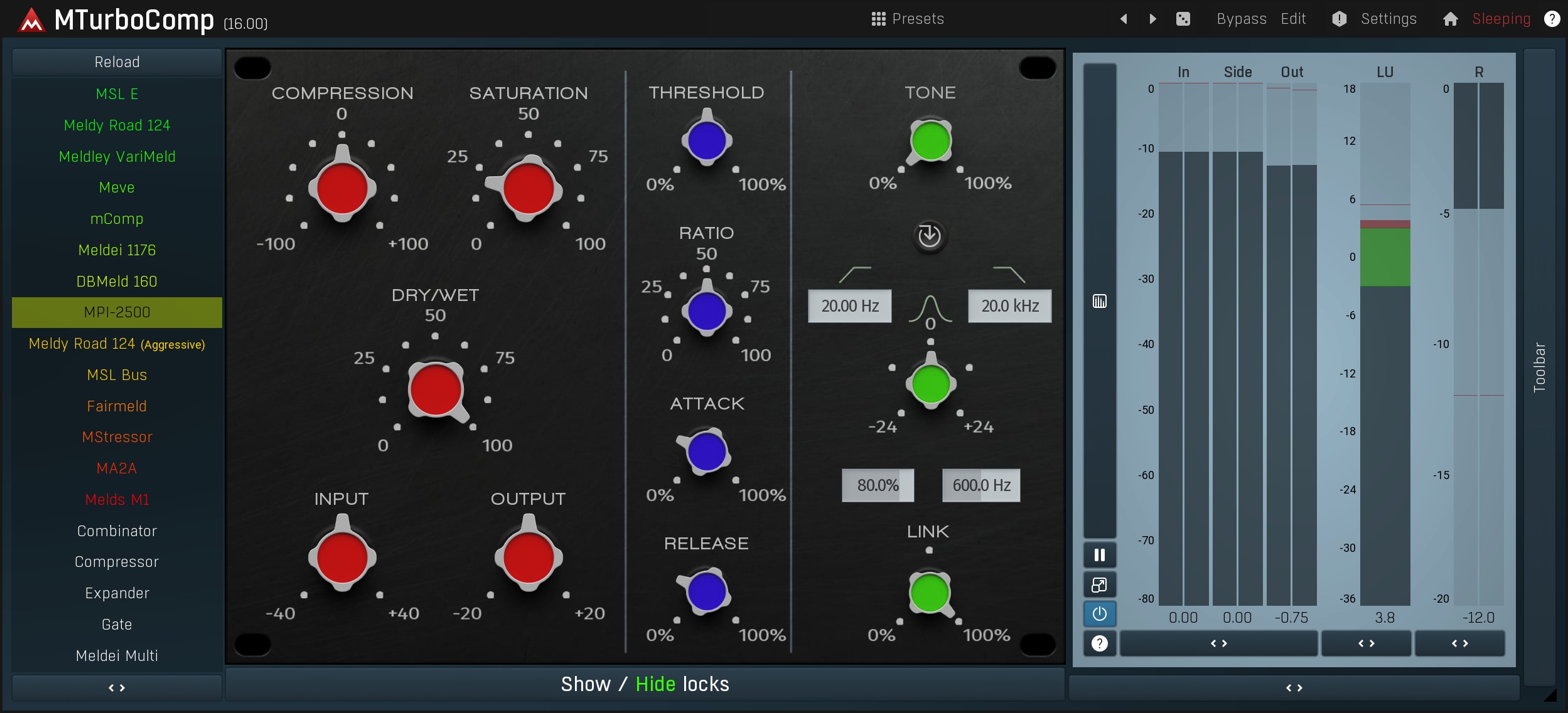
I would have no issues if the plugins discussed above were free or were relatively inexpensive, but Melda is targeting the professional market. MTurboReverb is listed for 299 Euro on the website and it looks like this
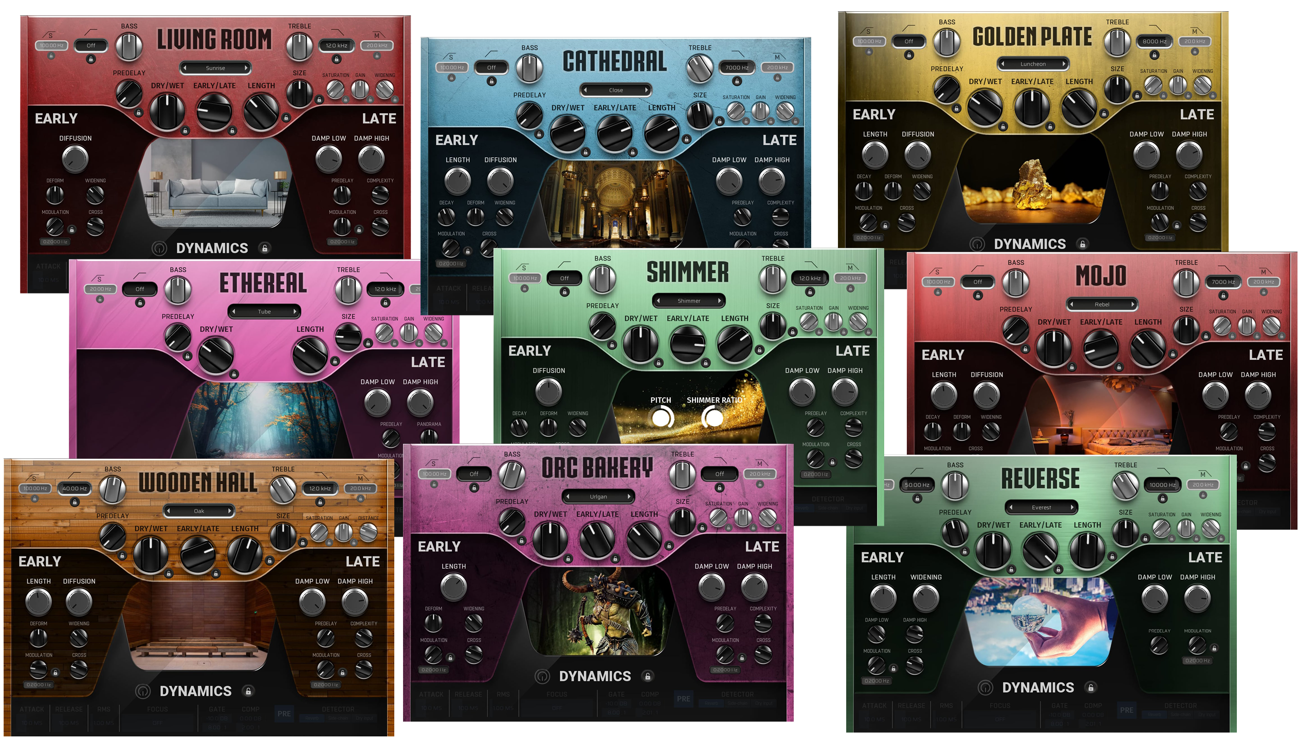
Once again I get the early 2000s vibes (which is funny cause I didn't even exist back then). And not in a "this feels like an authentic throwback to design practices at that time", but rather "it looks like design which hasn't stood the test of time." That "Orc Bakery" just feels a bit tacky.
User Interface is one of the most important aspects of any app, plugins included. How many times have you read that people bought a Softube plugin "because it looks so pretty"? I have seen such comments at least several times. Underestimating the need for quality design can be limiting the number of people interested in using the product.
Have a look at the comment section of this youtube video discussing Melda plugins, where people are saying they are not interested in them because of the UI - youtube.com/watch?v=_amS3c8Oku8 (not linked, so there isn't a big youtube preview image in the post). This is only a tiny share of potential customers Melda is missing out on.
Melda's plugins are genuinely great and in a lot of cases amazing. I use the free ones, for example. I would just really personally love if they could adjust the approach to UI design.
 Latest
Trending
Latest
Trending